Client details have been anonymised at their request. Industry, findings, and outcomes are real.
The Situation
A mid-market insurance comparison platform serving UK consumers wanted to understand why their quote completion rate was stuck at 64%. Funnel analytics showed a consistent 36% drop-off, but heatmaps and standard usability testing had not identified the cause.
Their head of product suspected that the complexity of insurance terminology and the density of their comparison tables might be creating barriers, but could not prove it.
The invisible drop-off: Standard analytics showed where users left. Neurodivergent testing revealed why. The comparison table was technically WCAG-compliant, but cognitively overwhelming for the 20% of users with ADHD, dyslexia, or autism. Fixing it increased conversions by 22% with no change to pricing or product selection.
What Neurodivergent Testing Revealed
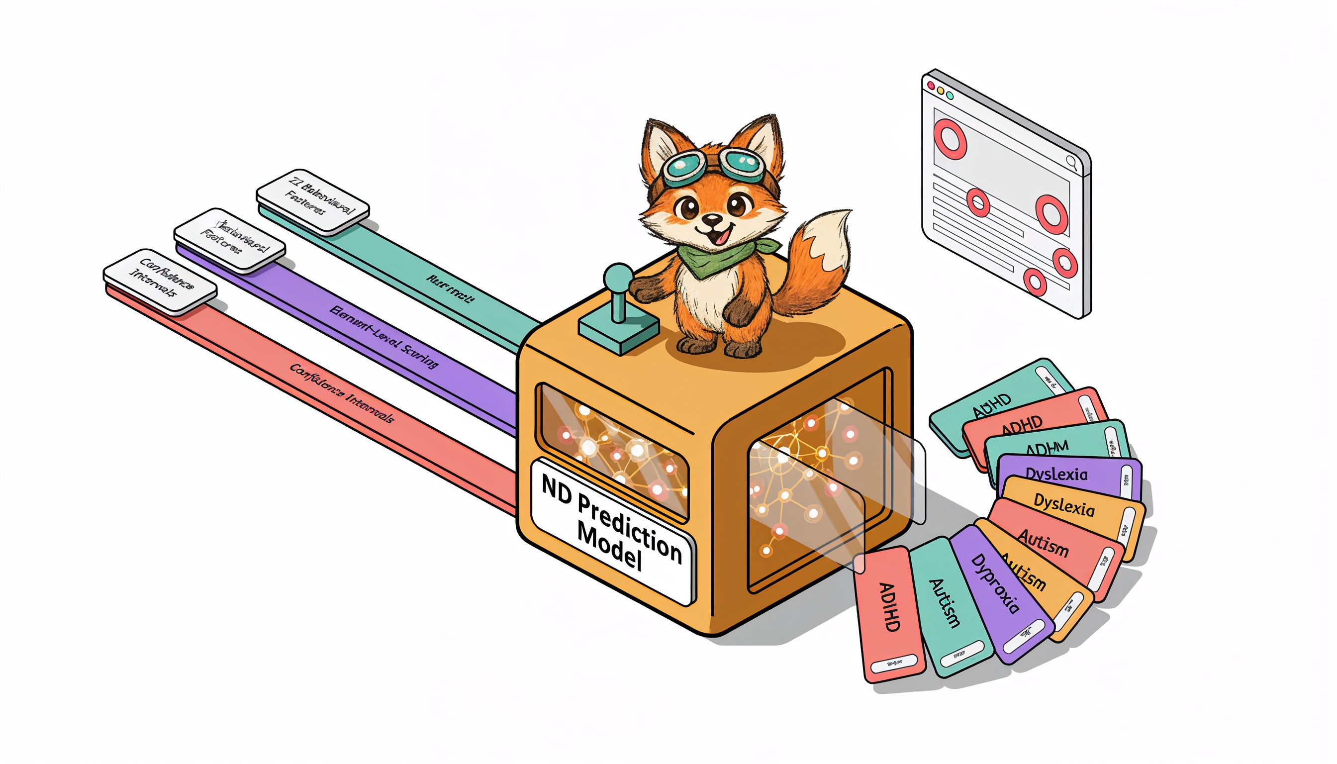
OpenScouter tested the end-to-end quote journey with 8 neurodivergent testers: 3 with ADHD, 3 with dyslexia, and 2 with autism.
The testing identified 31 barriers, concentrated in three areas:
| Barrier Category | Issues Found | Testers Affected | Primary Impact |
|---|---|---|---|
| Comparison Table Overload | 14 | 7 of 8 | Loss of place, abandonment, confusion about provider differences |
| Insurance Jargon | 9 | 5 of 8 | Testers opened external tabs or chose by price alone, ignoring features |
| Decision Fatigue | 8 | 4 of 8 | Overwhelm at results page, abandonment with intent to "return later" |
| Total | 31 |
Comparison Table Overload
The core product, a side-by-side comparison of insurance quotes, presented up to 12 policies simultaneously with 18 feature rows each. That is 216 data cells on a single screen.
- ADHD testers reported losing their place while scrolling horizontally and could not remember which column they were evaluating
- Dyslexic testers struggled with small text in dense table cells and confused similar column headers
- Autistic testers found the inconsistent use of ticks, crosses, and "N/A" across providers confusing and untrustworthy
Facial expression analysis showed elevated confusion and frustration at the comparison table for 7 of 8 testers.
Insurance Jargon
Terms like "excess," "no-claims discount protection," "aggregate limit," and "betterment" were used without explanation. The platform assumed users understood insurance terminology.
- 5 of 8 testers hovered over jargon terms looking for tooltips that did not exist
- 3 testers opened new browser tabs to Google unfamiliar terms, breaking their flow
- 2 testers selected policies based on price alone because they could not understand the feature differences
Decision Fatigue
After completing a detailed quote form (14 questions), users were immediately presented with 8-12 options with no clear recommendation or filtering mechanism.
- ADHD testers spent an average of 12 minutes on the results page before either choosing or abandoning, far longer than the 3-4 minutes the platform expected
- 4 testers abandoned at this stage, saying they felt overwhelmed and would "come back later" (none did)
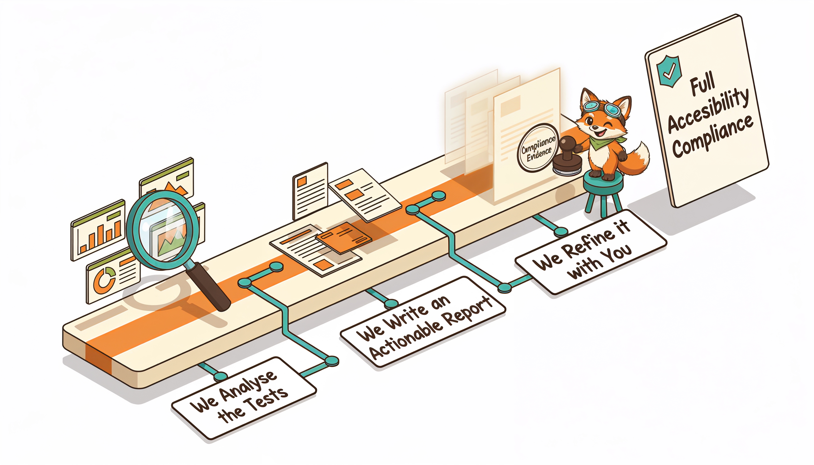
The Fixes
The product team implemented changes over 6 weeks:
-
Comparison Table Redesign
Limited the default view to 3 policies ("best value," "most comprehensive," "cheapest"). Users could expand to see more. Added row highlighting on hover to help track across columns. Standardised all feature indicators to a consistent tick/cross/partial system. -
Glossary Tooltips
Added contextual tooltips for every insurance term. Tooltips used plain-language explanations with concrete examples ("Excess: the amount you pay before the insurer pays. Example: if your excess is £250 and your claim is £1,000, you pay £250 and the insurer pays £750"). -
Smart Recommendation
Added a "Best for you" recommendation at the top of results, based on answers given in the quote form. This gave users a clear starting point instead of an overwhelming grid of equivalent options. -
Progressive Disclosure
Showed 5 key features by default, with a "See all features" expansion. Reduced initial information density by 72%, removing the cognitive burden from users who just wanted to compare the essentials.
The Results
The head of product noted: "The neurodivergent testers found exactly what our analytics hinted at but could not explain. The comparison table was technically accessible but cognitively overwhelming. Standard usability testers had never flagged it."
Key Takeaways
- Cognitive accessibility barriers hurt everyone, but neurodivergent users reveal them first. The comparison table overwhelmed all users, but neurodivergent testers identified why and where.
- Jargon is an accessibility barrier. Industry-standard terminology is not user-standard terminology.
- Fewer choices can increase conversions. Reducing the default from 12 options to 3 increased, not decreased, engagement.
- Facial expression data reveals what users will not say. Most testers did not verbalise their confusion with the comparison table. The webcam data showed it clearly.
The conversion insight: Cognitive accessibility and conversion optimisation are the same problem. When you reduce cognitive load for neurodivergent users, you reduce it for everyone. The 22% conversion increase came from fixing accessibility barriers, not from A/B testing button colours or tweaking copy.
Is cognitive overload hurting your conversion rates? Request a free accessibility audit to find out what neurodivergent testers reveal about your user experience.
